There are so many choices to make when designing a logo. What font looks best? Which colors? What shapes? Making those decisions can be the most joyful part of the logo design process. While you’re out on a web safari hunting for cool fonts or dancing frantically in a whirlwind of swatches, you may just forget to carefully address one of the most fundamental choices in logo design — what size should the logo be?
At first glance, this question seems superfluous. Your logo is a vector — it’s infinitely scalable. Like a hormonal teenager, your logo can’t be defined or constrained by “size.” Your logo yearns to be free and grow to whatever dimension it desires. Also, your logo is most likely going to live in a lot of different contexts, like on a website, social media, and print collateral. You might be throwing that bad boy on a billboard or semi-truck too. Why should you care about logo size?
Here is why making a deliberate decision about your logo’s size is such an important thing to consider right up front when you’re drawing out those first artboards — it’s two reasons, really.
you will be designing stuff with this logo. You want it to be easy to work with.
Your client will be using this logo too, and their use cases are usually smaller in number than yours.
Have you ever tried to design a nice business card — you know the one, it’s got a solid color flood on the back with your beautiful logo in white, smack-dab in the middle — and you go to place the logo, but it’s positively gigantic?

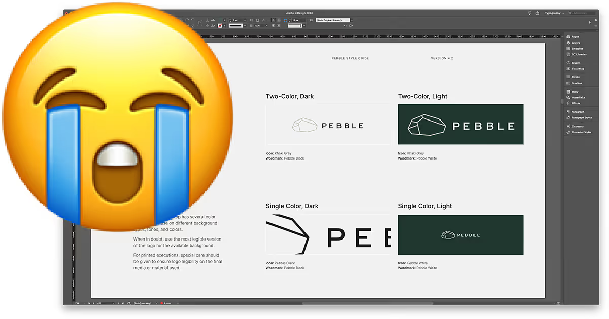
What about this scenario — you’re laying out the style guide for your client, and you place multiple logos at once. They all come in at the wrong size, or worse yet, different sizes, and you’ve got to spend a bunch of time resizing everything.
Not only are these two scenarios inefficient — they’re also totally avoidable.
By defining your logo’s size correctly before you finalize your design, you will save a ton of time and hassle when you’re building out the rest of your deliverables. Imagine barely needing to resize your logo whenever you use it in a new design. Wouldn’t that be swell?
If you think you are frustrated using a gigantic logo, or at least one that isn’t generally well suited to your project, imagine how your client feels every time they go to make a PowerPoint. Not only will the logo be the wrong size for them, but they might not even know how to resize the logo if it is.
If you want to keep the clients you have and enjoy getting top dollar for your work, you’ll want your files to be as easy for them to work with as possible.
Alright, so I’ve rambled on and on about all the problems, but what’s the answer? What is the best size for a logo? How big or small does your artboard need to be?
It depends.
Hear me out, though! When you take on a logo project, you should have an excellent idea about where your clients plan to use the logo the most. Let’s use the most standard example we can. Imagine a company that uses their logo on the most common things. They want their logo on a business card, letterhead, envelope, a website, and a brochure. In this case, you can quite safely determine a standard size for your logo that is best suited to those contexts.
Since you know where the logo will be used, you simply need to pick a size that works well in the most common use case.
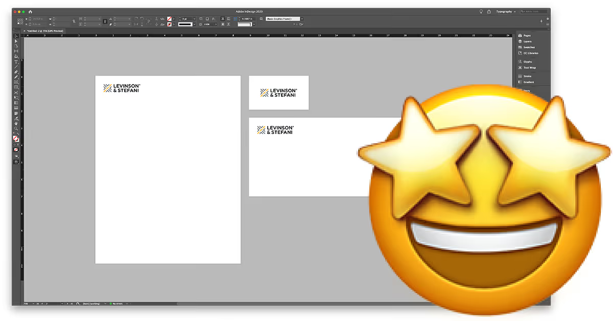
One excellent way to test out a standard size for your logo is to set up a document at letter-size (or A4, if you’re into metric), place your logo in and just mess around with scale. During this exercise, ask yourself what feels right. What size is a really great proportion? Use those beautiful designer’s eyes you’ve got and find something that fits. Then make it a nice even number. Depending on if your logo is vertically or horizontally oriented (wide or tall), you can tweak that size that you eyeballed to be a whole number. If your logo size is a whole number, or at least something with a “.5” in it, it will be that much easier to remember when the size makes its way into your style guide.

If your client is mostly using their logo on PowerPoint presentations and their website, set up your artboards at those sizes.
I don’t honestly see any reason why the standard size for a logo needs to be larger than 1.5–3 inches.
– OR –
108p–216p (Points)
9p0–18p0 (Picas)
40–80mm (Millimeters)
4–8cm (Centimeters)
If you use the exercise from earlier or my recommendation above to settle on your ideal logo size, I say go ahead and make a template. If you use Illustrator to design your logos, it’s super easy to set up a logo design wonderland, full of organized artboards that are just the right size! Here’s how:
If you really enjoy this layout, you can go ahead and save it as a template or preset so it’s always available to you when you start a logo project.
That’s it! You’ve worked out what your ideal logo size should be based on the most common contexts for the logo. Your files will now fit perfectly when you place them in a new design, and your clients will be able to pump out PowerPoint presentations with ease.
Now that your logo is designed at the perfect scale, you’ll need to wrap up your project by exporting all the logo files for your client. I’ve developed an extension for Adobe Illustrator called Logo Package Express which can export every version of your logo in every file format your clients need in just a few minutes.