There are so many beautiful fonts in the world. It would be a shame not to use as many as you possibly can in your logo design career, right? Wrong!
I doubt any of you are seriously considering churning out logos that are collages of calligraphy or monospaced montages. Still, there are several scenarios in which it is tempting to pair fonts within a logo or brand name.
This is the easiest trap to fall into, especially for young designers. You may have idealized the logo as the single most critical manifestation of the brand. Take the pressure off because it's not. A logo's primary job is to be easy to read and recognize, helping to reinforce the brand's name rather than showcasing its aesthetic. In case I'm not being clear, it's better to be able to read the logo than to marvel at its artistic and deeply meaningful execution.
Recommendation
🚫 Do not pair.
Please avoid the temptation to create a lot of typographic contrast within the logotype. Many things are going to make your logo stand out:
Given all these wonderful avenues for differentiation, you do not need to lean additionally on multiple typefaces to produce a logo that stands out from the crowd.
Let's imagine you are tasked with designing the logo for a new line of baby food products that all contain superfoods to maximize babies' growth and development. Let's call the brand "Power Baby." It's very easy to see how you could use a pair of fonts in a logo for this brand. First, it is two words. One font for each word makes sense. Second, the words are inherently contrasting. Power is forceful and harsh. Baby is soft and fragile. If there's contrast in the brand name, why not incorporate it into the logo?
Recommendation
⚠️ Proceed with caution.
Similarly to uniqueness, there are many ways to bring meaning to a logo design. Imagine how easily you can add meaning to the "Power Baby" logo through color. Imagine "Power" in an electric blue color paired with a vibrant pink "Baby." Power, energy, and softness can all emerge with this simple use of color, so why make the brand name harder to read by using multiple fonts? If you do choose to pair fonts, do not stray from the font family you've chosen. Pair a heavy and light weight, or a wide and narrow style, from the same font family.

Sometimes, a logo needs to convey both the brand name and additional information about the company's identity or purpose through a tagline or slogan. You may want to consider using different fonts to convey a sense of hierarchy—to let the viewer know which is more important, the brand name or the tagline.
Recommendation
✅ Do pair!
This is the perfect opportunity to bring contrast and hierarchy to your logo design. The brand name should stand out as the most crucial element, while the tagline or slogan should be secondary in importance. You can get creative by pairing weights and widths within the same family or entirely different classifications of fonts, such as serif and sans serif. Just ensure the fonts are harmonious enough to appear cohesive.

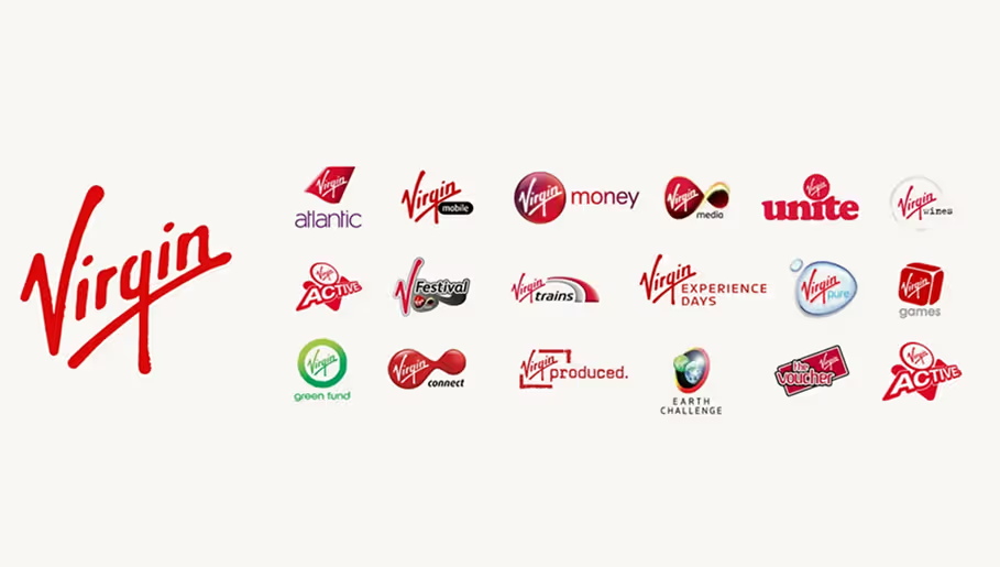
Imagine a soft drink company with many flavors or a mega corporation with brands in multiple industries. These brands want to remind their audience who Big Papa is while giving each of their divisions a distinct personality of its own. In this case, it is easy to see how a designer might want to use one font for the parent brand and different fonts for the sub-brands.
Recommendation
✅ Do pair!
This scenario is the most accommodating to font pairing. Using the same font for every child company or product fails to create the necessary differentiation. Choose fonts that clearly represent the sub-brand or product while complementing the parent brand font, and you will have great success.

Overall, I recommend exhaustively exploring all other options for creating contrast and hierarchy within a logo design before resorting to font pairing. Use color, scale, spacing, and meaningful symbolism to bring individuality to your logo. These elements are powerful tools in your design arsenal, inspiring creativity and innovation. If your heart is set on using multiple fonts in your next logo design, then use these qualities to ensure a great pair:
Baseline & x-height harmony
Choose fonts whose lowercase x-heights align closely for clean stacks.
Shared structure, different style
Look for typefaces that share core shapes but differ in weight or serif/sans style.
Stroke-contrast compatibility
Match fonts with similar thick-to-thin stroke dynamics to avoid visual dissonance.
Proportional rhythm check
Pair fonts with compatible widths and spacing rhythms to maintain visual balance or deliberately exaggerate differences for strong emphasis.
If you started this article excited to build logos with multiple fonts, I hope I've reined you in a little. Use font pairing sparingly, primarily where a clear hierarchy or differentiation is needed, rather than simply to stand out. This caution will ensure your design choices are thoughtful and purposeful.
Logo Package Forge is the only tool for testing font combinations in Adobe Illustrator. Compare font weights, widths, and classifications with ease.
